Distracted Looking
Anton Ginzburg in conversation with R.H.Quaytman
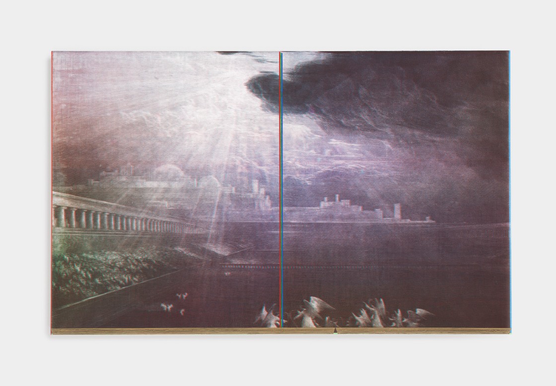
R.H. Quaytman Spine. Chapter 20 (iamb), 2010 Oil, silkscreen ink, gesso on wood
R.H. Quaytman: Anton, looking at your ORRA series, I find their diagrammatic quality interesting. And although I often find color theory problematic, these works look good.
Anton Ginzburg: I started working on the ORRA paintings in 2016. They are conceived as a series of color studies on octagonal boards. At that time, I was researching the color theory of Mikhail Matyushin, who was an important figure of the Saint Petersburg (then Petrograd) branch of GINKhUK and VKhUTEIN. Matyushin’s color theory was based on expanded perception or ZorVed as he called it. If we were to consider two major schools of color theory-—one put forth by Goethe and the other by Newton—I would align Matyushin’s approach closer with Goethe’s. Matyushin shares Goethe’s emphasis on color as light, where blue and yellow are understood as the two base colors. In fact, for Goethe, they are the only pure colors.
RHQ: Goethe inspired most theosophical and later modernist color systems. Dr. Kremer recently told me about one model of color theory based on the ‘color space’ that was apparently developed by Albert Munsell, an American painter and inventor, and that Cheney Thompson worked with. It exists in a three-dimensional space using color—hue, chroma, and value. But the crazy or important thing to remember is that, in nature, color has no spheres.
AG: Both Goethe and Newton approached color as light. And each of their theories, especially where the spiritual was concerned, were built on that.
RHQ: And that’s when color theory goes flying out of the window, for all colors in painting come from particular sources, minerals, chemicals and have nothing to do with each other in that organized way. For instance, look at where cadmium red is coming from, versus magenta.
AG: The tradition of classical Western painting was first preoccupied with the idea of illusion, and then with the deconstruction of illusion. But of course, with twentieth-century painting, color starts to exist in the space on its own. Harvey Quaytman4, whose work I admire so much, was one of the artists who actually emphasized the materiality of the paint. Consider the use of rust in his abstract compositions from the mid-1980s—you can see the oxidation and how real it is. He pushed color beyond mere perception and focused on the physicality of the pigment itself.
RHQ: Yes, he was into the craft of pigment. But also, my father liked to hang out with pigment dealers and talk shop. Georg Kremer was a close friend. They would often get together in my father’s 231 Bowery studio and just talk, talk, talk. Drink, smoke, and talk, talk, talk.
AG: I thought Kremer was based in Germany in Munich.
RHQ: He was. But he always stayed with my father when visiting New York. His store in those years was around the corner, on Elizabeth Street. One night, he was shot and nearly killed in the doorway to our loft. Downtown wasn’t all that safe back in the ‘80s.
AG: I love Kremer’s Pigments shop on the Westside. I spent a lot of time there while working on the ORRA series. I was set to develop these color studies as GINKhUK’s Laboratory of Color students would: preparing the boards with multiple layers of gesso, sanding them, and, of course, making the paints from raw pigments and minerals. I wanted to deconstruct that process in order to carefully analyze all of its steps. The ultimate goal of GINKhUK’s Laboratory of Color was to create a universal language of color.
RHQ: Right.
AG: The ORRA paintings are a collection of symmetrical compositions on the octagonal boards. The octagonal shape makes it almost like a tondo5 painting; I like an active diamond shape and a square shape in one. On the one hand, it is more active than a square, but it is also more balanced than a diamond.
RHQ: Yeah. It’s harder with shapes. Shaped paintings really complicate things. Recently, I’ve resuscitated a pattern I saw almost twenty years ago on an abandoned factory floor in Łódź. It was a beautiful pattern based on the hexagon in black, grey, and white. It seemed based on the star of David. When you looked down across its expanse, it seemed like a thousand eyes were looking back up at you. It became engraved in my mind and I did a small painting based on it. If you continue the pattern, it becomes a grid of small circles pretty quickly. I often try to anchor visual ideas geometrically. Also, it’s good to just experiment and play with circles, ovals, squares, and right angles—without any rules.
AG: Geometry is crucial for me as well, but it was also important to preserve the painterly quality. Even though a lot of my works are hard-edged, the brushstroke is always visible. This way, the hand is always present. The series is really a system of color studies—the compositions behave differently depending on the color fields’ proximity to each other.
RHQ: You mean each color exploration sets a different mood, even though compositional elements are the same?
AG: Besides emotive color properties, this body of works was also an experiment across various media, including sculpture and environments. For the exhibition at the Southern Alberta Art Gallery, I also painted murals and built several sculptures. Sky Columns II (Blue) is made of porcelain and is based on gradations of the color of the sky. It is not unlike the eighteenth-century cyanometer, an instrument to measure the blueness of the sky developed by De Saussure. Another sculptural installation is based on the spatial constructions of Aleksander Rodchenko. I think it is such an explicit yet powerful formal exploration.
RHQ: But how are these spatial studies differ from each other? What was the process of working on them?
AG: Rodchenko would arrange groups of wooden blocks to figure out how they function and activate the space. It was like developing a really raw and structural modernist alphabet. During my residency in Canada, I spent a month re-building these constructions based on his drawings. I was deep in the mountains of Southern Alberta all by myself and surrounded by endless forests. But I’m not Rodchenko, and the project needed a next step, an act of transgression. So I set it all on fire as a final gesture. And the sculpture was exhibited as the charred remains of these Constructivist forms.
RHQ: Katarzyna Kobro burned her sculptures for different reasons having to do with heating. Sorry, I keep bringing up Poland but my next chapter opens there in a few months, so Kobro has been on my mind. You also had several murals—color fields with mirrored glass panels over them. How did you approach them?
AG: The murals’ color palettes were developed based on the location and venue where they were sited. I overlaid color fields with glass panels with mirrored geometric compositions. What gets reflected in them is always in flux, depending on your position in relation to the artwork.
RHQ: For me, the hardest thing about painting is drawing. Because it is so unavoidably coded by one’s time. Like a fingerprint, drawings communicate their era.
AG: Like Hilma af Klint, for example, at the Guggenheim show. I was looking at her early drawings and paintings in the exhibition, which were very academic.
RHQ:The incredible thing, however, is that, in her case in particular, you cannot easily identify when her paintings were made. Maybe this is due to the fact that what is foregrounded on them is their geometry.
AG: The motif of the spiral was also very resonant in Hilma af Klint works and I thought that it was fascinating to see it in a building designed by Frank Lloyd Wright. And of course, your installation at the top section of the Guggenheim felt really meditative and engaged with her works. It shared the formal vocabulary of Hilma af Klint, but the way you engaged with the architecture of the building itself was really contemporary. One could really tell what was made in the current moment and what was not, even though they existed in the exact same space. It felt as if there was a shift, a ripple.
RHQ: Yes, like a ripple spiraling.
AG: What makes an image current? How does one sense this timestamp?
RHQ: How we look at images today is complicated. I was scrolling through Instagram, saying “Why is it that I feel an almost physical compulsion to look at those images and how does time seem while looking?” It shows you how powerful images are. Images are not stable, they are not simply what they profess. They don’t stop and start.
AG: David Joselit also has a different take on reading images. He proposes reading images in art against their historical context, against the network of human actors that engage with art, in its distribution and exhibition. The denser the image, the more time it takes to read it. Perhaps there are two different types of images: the “slow” and the “fast” ones.
RHQ: First of all, time seems to evaporate while we are looking. But there is a kind of timestamp to every image. Some painters seem to paint for slow looking and some for fast. But how you look at something is up to you. I notice that oftentimes art historians tend to be fast lookers. I myself am interested in distracted looking.
AG: Even if we consider the language of modernism, its grammar, and how engrained it is in everything around us, some art historians still claim that its development and evolution are over. Is it still relevant though? I personally think that it is still a language that has the capacity to be understood universally.
RHQ: Very much so. These notions of ends and beginnings are tools for art historians and the market.
Art had to adjust to so much in such a tiny, tiny, short period of time. And why can we not say that the Black Square is still doing its work, and that there actually is still this need to respond to the world in radical ways visually? How do images say “yes” or “no” and how do they feel in relation to the present?
AG: If we look at the methodology, ambition and range of modernism, it becomes obvious that it is still a valid language that keeps developing. It is not over. It is still working.
RHQ: I think visual art seems to offer ways to feel and resolve paradoxes. On a very simple level, it is the only tool we have to communicate with science. It is as if modernism predicted more than it planned. And I don’t know what the alternative is. I really don’t. But that also becomes very problematic. And modernism, remember, isn’t anyone artist. It is an over-arching concept meant to be seen in past times. No modernist artists thought of themselves as modernists, did they? When you think about it, it seems that they weren’t thinking about themselves at all.
AG: Looking at the twentieth century today, in relation to modernism, for example, one could see that some of the major experiments went tragically wrong, but at the same time it doesn’t mean that the belief in progress is wrong. And that was what Strzemiński was talking when addressing realism as an evolving process of the development of the human cognitive faculty that are linked to human activity.
RHQ: I liked the fact that he was an artist who authored his own version of art history. He was able to put the figure back in the landscape. It is good if artists can be authoritative art historians, authoritative curators, authoritative critics, as well as makers. Conceptual art showed us those tools. And Korbo and Strzemiński’s tools came from Russian Constructivism. Now we must construct and deconstruct repeatedly before being able to say, “Ok, here is a proposition in a painting. Here is the figure and here is the landscape.”
AG: But I still believe in the possibility of a universal context as a search for common points of assembly between the most diverse expressions of human experience.
RHQ: Well, it’s the only thing that makes sense at all. So that’s why the whole structure that we’re dealing with feels so out of whack. Because it would seem that the individual author can’t catch up to the facts. This is what early modernists understood and why they still offer such extremely valuable ideas and models. modernism was on to something about taking the “I” out and thinking about the “us”. But somebody will have an idea. There will be the next thing. It’s important to visualize. The only way to explain an idea, basically, is to visualize it.
......
R. H. Quaytman is an artist living and working in New York City. She studied at Bard College and at the Institut des Hautes Études en Arts Plastiques in Paris, and received the Rome Prize Fellowship from the American Academy in in 2001. In 2015, Quaytman was awarded the Wolfgang Hahn Prize with Michael Krebber. Quaytman has taught at
Bard College, in addition to lecturing at Princeton University, Cooper Union, Columbia University, and the Yale University School of Art. In 2005, she co-founded Orchard, a cooperatively-run exhibition and event space that concluded its three-year run on the Lower East Side in 2008. Her work is held in the permanent collections of the Museum of Modern Art, the Whitney Museum of American Art, the Solomon R. Guggenheim Museum, the San Francisco Museum of Modern Art, the Institute of Contemporary Art Boston, the Museum of Fine Arts, Boston, the Art Insititute of Chicago, the Tate Modern, the Museo Reina Sofia, the CCS Bard Hessel Museum of Art, the Baltimore Museum of Art, and the Stedelijk Museum Amsterdam, among others. Her work was featured in documenta 14 (2017), the 54th Venice Biennale and the 2010 Whitney Biennial, and solo shows dedicated to her work have taken place at the Solomon R. Guggenheim Museum, New York (2018), Secession, Vienna (2017), the Museum of Contemporary Art, Los Angeles (2016), Miguel Abreu Gallery (2008, 2015), Tel Aviv Museum of Art (2015), Renaissance Society (Chicago, 2013), the Museum Abteiberg (Mönchengladbach, 2012), Gladstone Gallery (Brussels, 2012), the Kunsthalle Basel (2011), Galerie Daniel Buchholz (Cologne, 2011), the San Francisco Museum of Modern Art (2010), and the Institute of Contemporary Art Boston (2009).
