https://archinect.com/features/article/150143033/conversations-amongst-friends-architect-charles-renfro-and-artist-anton-ginzburg-discuss-art-architecture-and-the-idea-of-disappearance?
…
Conversations Amongst Friends: Architect Charles Renfro and Artist Anton Ginzburg Discuss Art, Architecture, and the Idea of Disappearance
By Katherine Guimapang
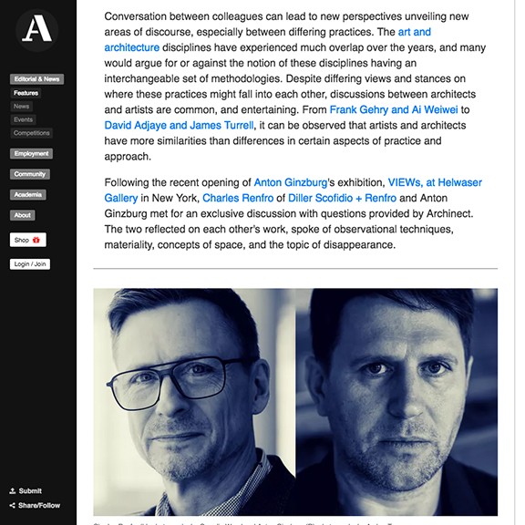
Charles Renfro (CR): Could you tell me about your recent VIEWs exhibition?
Anton Ginzburg (AG): VIEWs is about the process of viewing, framing, and fragmentation. In VIEWs at Helwaser Gallery, the gallery space comprises two rooms, and in each room, painted murals are installed. The paintings are installed on top of the murals and function as propositions of multiple viewing points around the gallery. In the first room, the walls are painted floor-to-ceiling, turning the gallery space into a color installation in and of itself. It becomes the discourse and the universe of the discourse; you have the painting as an object, but at the same time, you have the environment that you could enter and experience. In the second room, the painted mural, Color-Space Initiative (2019) functions as an isolated representation of the space and echoes the verticality of porcelain columns in the first room.
CR: The two primary rooms function as different spaces of discourse, which I think speaks to the interesting lexicon and pedagogy around linguistics and art history you present in your work. At the same time, your work is distinctly experiential. It challenges gravity and vision in a way that resonates with the work we’ve designed at DS+R. We try to defy and tweak the physical expectations of the everyday through spatial and optical special effects, ranging from cantilevers to framing devices.
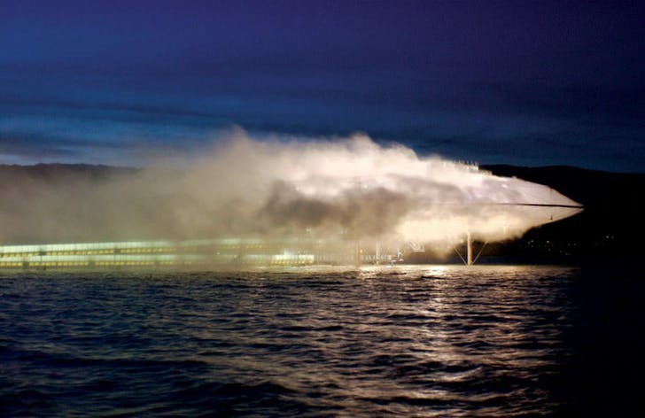
AG: One of my favorite DS+R projects is Blur.
CR: There is certainly some overlap between your work and the Blur building: both deal with notions of disappearance. The Blur building was intended to be a media pavilion by the organizers of the 2002 Expo in Switzerland on Lake Neuchâtel. Our site was at the edge of the lake. Rather than work in media—something we were known for and something which usually demands high fidelity and supervision—we thought it would be interesting to make a building from the site itself. The lake would be both site and material camouflaging the building. Rather than demand optical acuity, the building occluded one's view, heightening visitor’s awareness about their dependence on vision to understand and navigate the world.

AG: Yes, the latest series, VIEWs , was a deconstruction of the act of viewing. The wood panels have a specific shape, and abstract compositions were developed with a focus on vision. The shape of the panels comes from the diagrammatic representation of the angle of human vision — and I introduce the process of viewing as its subject. A diagram disrupts the representation of a stable object and expresses the action onto the object. It’s also connected to the idea of perspective—a cornerstone both for architecture and art. In Russian modernist trajectory, special attention was given to a reverse perspective phenomenon (characteristic to Russian icon painting). It was explored and described in detail by Pavel Florensky, who was teaching in the VKhUTEMAS, and was close to Constructivist circles and Malevich in particular.
CR: Is this the main composition of those pieces? A flat bottom, the triangle, these pieces folded over and an arch that joins them?
AG: Yes, so the two intersecting lines are parallel to the sides of the panel, establishing triangular compositions. They create planes of color that interact within the compositions. In larger paintings, I draw on the movement of color in space. The planes of color on the border of the paintings give the work a prismatic quality. In the smaller works, it’s also these main elements and the triangle, which create a figure-ground in relationship to the space.
CR: The unfolded planes peel off the “stage floor” and start to shape a theater perspective. The arch that sweeps across the top evokes the proscenium arch that frames the stage. It acts as an artifice that you pass through and communicate with simultaneously.
AG: It’s both descriptive and self-referential. Coming back to the shape [of the paintings]: for me, it was kind of a discovery because I felt that there is a unique personality to it. It’s interesting that you brought up the space aspect. Even though the piece is very flat, there is a spatial quality to it.
CR: The implied depth and unfolding can also be read as origami. The arc can be read as the crease that’s made when the paper is unfolded and flattened out. I find the ambiguity of those readings really interesting.
AG: What do convex shapes mean to you architecturally? How do you feel about it and how does it relate to space in architecture?

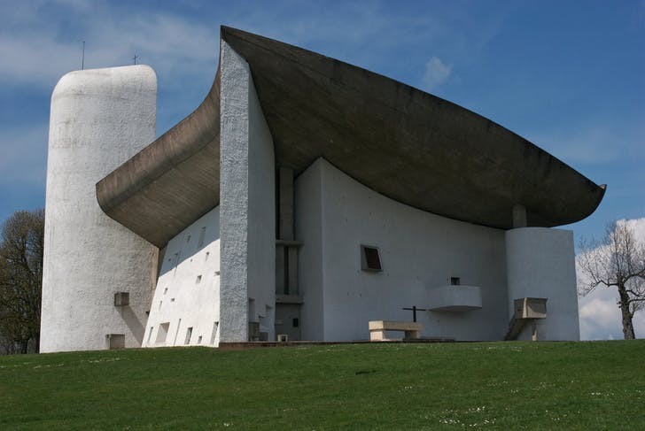
CR: Le Corbusier was a master of convex (and concave) shapes. You can see that in the chapel in Ronchamp- a masterpiece comprised of a convex roof and a concave wall. He made gestural, corporeal shapes that were based on the body and which embraced the body.
AG: It’s the human element that exists in the geometric modernity.
CR: Yes. There were two strains of high modernism: the mathematical and industrial Mies van der Rohe strain and the abstract symbolism of the Le Corbusier strain. In modernism, the convex gesture is somehow both symbolic and linguistic – they took you to another place. In the high modernism of Mies, those gestures were self-contained and literal. They represented themselves and only themselves. The language of exposed steel with cruciform columns was intended to be an end in itself. But the real end is that it too was linguistic and ‘represented’ industrialization.
AG: I’m also thinking about the idea of the seam – which I introduce in VIEWs. For me, it’s a structural detail, but also a place where the past and the future meet. It’s the moment of the present. Like any architectural project, it’s defined by the details: how the materials meet, how the functions meet, how the times meet.
CR: In architecture, a seam literally functions as the joint between two materials. Within a building, the meeting of materials has to mitigate their distinct properties and qualities and how they will evolve, taking into account expansion, reactions to heat, changes in color. It’s about anticipating the wages of time on the building. It’s something that I think you allude to in the joining of these colors.
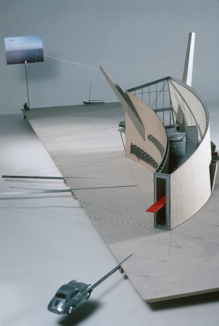
AG: There’s a well-known piece done by DS+R, Slow House, which includes a projection as one drives to the Slow House. It is based around the idea of the curve and the revealing of the building through that curve—that is experiential.
CR: Actually, it was less about revealing the building and more about revealing the view outside a picture window with a live video feed of that view. The curved floor plan unfolds over time, progressively bringing one closer to the simultaneous authentic and mediated ocean view – a kind of view that is the ultimate signifier for a beach house. That semiotic overlay between the real and virtual is a theme that I think both our work explores. This gets back to the curve conversation— what does a curve mean? We don’t really use that many curves in our projects. The curve in the Slow House was a geometrically derived section of a circle, rather than a gestural hand sketch.

AG: Or Frank Lloyd Wright with his spirals.
CR: We’re also interested in spirals, and actually so was Le Corbusier. But for us, the hand sketched, gestural, willful artistic line isn’t valid in itself.
AG: Do you permit it in your work?
CR: No. It’s not allowed.
AG: Is this a philosophical decision or formal?
CR: It’s both. Formal compositions in our work need to be legible and accessible to all users. It can’t be driven by subjective interpretations of beauty. Beauty is not an attribute, it’s a scripter.
AG: With Le Corbusier’s Beistegui Apartment in Paris, he suggested a horizon line through a wall, cutting off l’Arc de Triomphe and all of the Paris landmarks but chopping it up. It becomes very playful, but at the same time, a kind of violent gesture of slicing through the history.
CR: That kind of gesture is something that makes the observer appreciate the visceral and the fundamental – the abstracted and pure reading of the world, rather than its diluted context.
AG: I’m interested in the idea of universalism. It’s kind of like a horizon line— it’s ever elusive. It has the potential for an exchange, humanity and progress, but, at the same time, it can be dangerously authoritative and alienating. There’s always the question of how you connect in an accessible and open way, how do you adapt to a specific site?
CR: For me your art is a little bit like architecture in that it’s time-based and experiential, and particular to its place.
AG: It’s often determined by a discovery, by experiencing the site— the relationships that are created through the process, where both artwork and environment create an effect that is not necessarily planned, yet it comes out of a collective intention. Like an organic kind of process.
CR: Yes, things should be both organic and determined.
.....
Charles Renfro is a partner at Diller Scofidio + Renfro (DS+R). He joined the studio in 1997 and was named a partner in 2004. Renfro led the design for a number of projects including the the James Beard Award-winning restaurant The Brasserie in New York and the Institute for Contemporary Art in Boston. He was also partner-in-charge of Zaryadye Park, a thirty-five acre park adjacent to the Kremlin in Moscow. Renfro has also led a number of academic projects at Stanford University, UC Berkeley, and Brown University and is currently designing new facilities for Columbia University, the University of Chicago, and the University of Toronto. Outside of the US, Renfro is leading the design of the Museum of Image and Sound in Rio de Janeiro; the Tianjin Juilliard School in China; and Adelaide Contemporary, a new gallery in Australia. Renfro is the recipient of WSJ’s 2017 Architecture Innovator Award, the Texas Medal of Arts Award, and is a National Academician. He is a faculty member of the School of Visual Arts in New York City.

